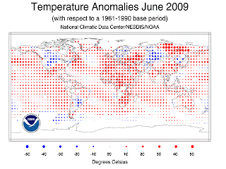
An example of a really well-done graphic is from the NOAA website. Science and particularly math afficionados seem to have a particular affinity to following weather science. (I am wondering whether it is a visceral reaction to global warming naysayers who, the scientists think, are possibly insulting their learning.)
The graph is a world temperature graph and this type of graph has come in so many different forms, it is difficult not to have seen such a graph. What I like about this is the elegant and non-intrusive form in which the overlays are done.
• By using dots and varying the size of the dots, the creator of the graph is making sure that the underlying geographic details (important in a world map where there is great detail that needs to be captured in a small area, therefore you cannot use very thick lines for country borders) still come through.
• The other thing that I liked is some of the simplications the creator has made. The dots are equally spaced but I am pretty sure that’s exactly not how the data was gathered. But to tell the story, that detail is not as important.
The graphic came from Jeff Masters' weather blog which is one of the best of its kind. Here's a link if you are interested.
1 comment:
Nice graph. This part of data analysis, data visualization, is often overlooked in favor of the more 'sexy' modeling side of the house.
Post a Comment